Massel starting operating in Sydney in 1982 and in 1987 the company released a range of premium products with no animal content, no added MSG, no gluten and no lactose.
Massel holds a prominent position in the Australian market, with its range exclusively targeting the discerning consumer looking for high quality, superior performance and great taste. Massel specialise in flavouring products for the consumer and the food service market, as well as providing exclusive flavour-blends for the food manufacturing industry. Massel’s product portfolio continues to be among the most innovative worldwide.
As discerning consumer needs evolve, so too must the brands they buy. Tweak was engaged to evolve the original design in 2012, and due to its success, were tasked with revolutionising the range in 2015. Growing concerns among consumers are purchasing products that contain ingredients which may be harmful, or unbalance their dietary requirements. Massel products have always been made using only natural vegetable ingredients, as well as eliminating ingredients that may be harmful, such as a preservatives or gluten, etc. The credentials Massel has in this area are unsurpassed and widely known among the target audience – the mission; to attract new consumers through visual cues, more widely known to be attributed to these credentials.
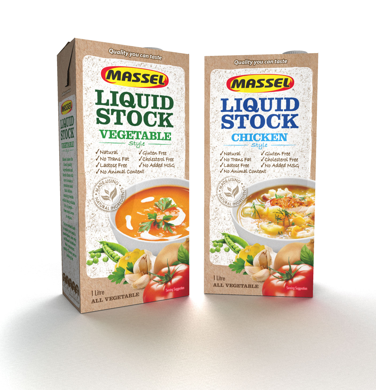
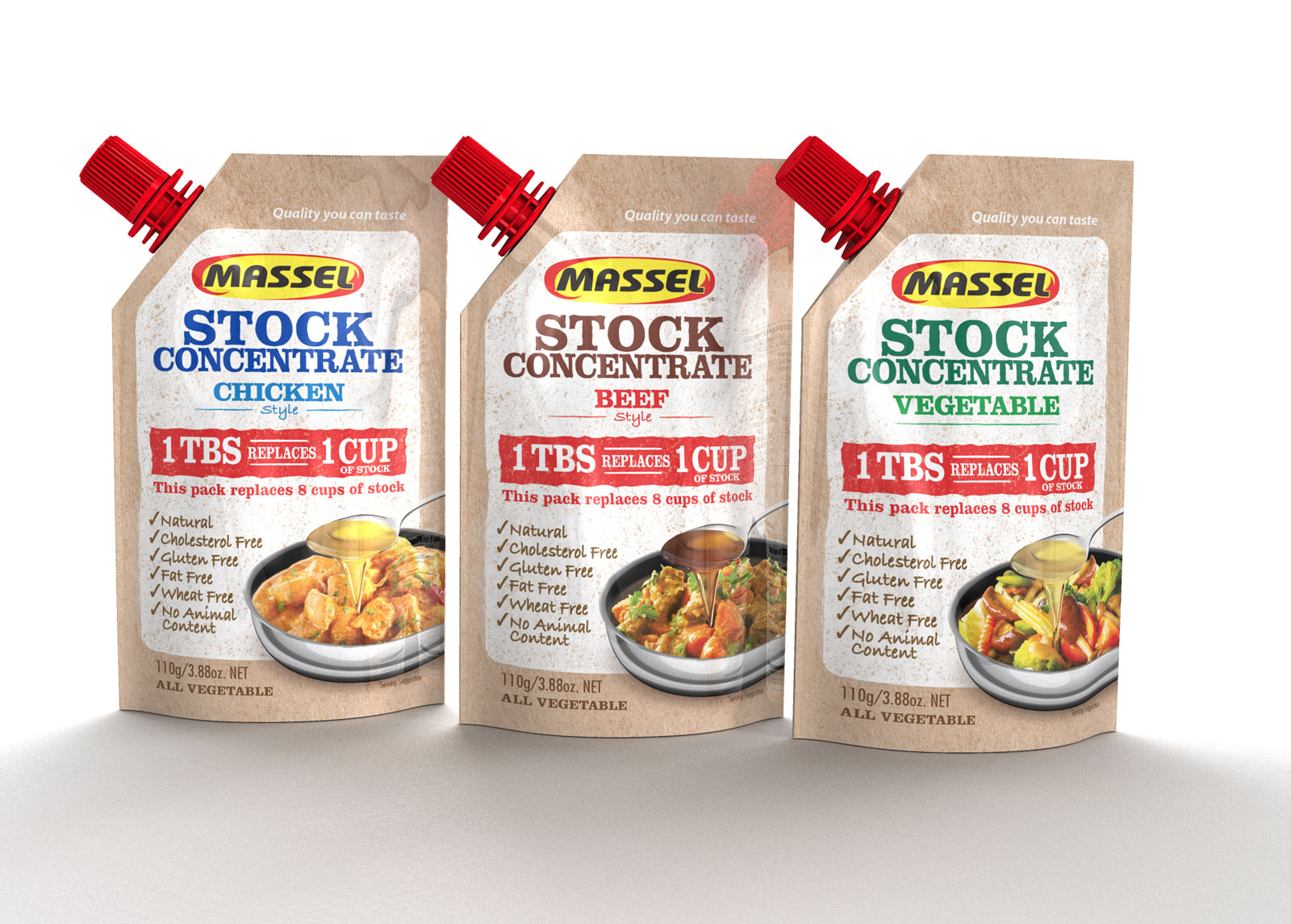
Massel needed to not only communicate with words, but visually own its place on shelf, as an all natural, great tasting, premium quality product – a collective set of attributes that no other product in the category can claim. Brown paper and white textured panelling sets the scene; signifying all things fresh, natural and crafted – attributes perfectly aligned to the range. The use of white, a key brand signifier, along with the original Massel logo, are carried forward from the previous design to maintain the brand look. Delicious food photography, combined with fresh raw ingredients, increase appetite appeal, injecting colour to create a design that is alive and full of flavour. A clearer hierarchy of information assists in navigating product type and flavour, while the typographic style is reminiscent of farmers markets; hand drawn, adding a crafted, personal touch. The Stock Concentrate is an innovative first for the category, and as such, the usage communication is brought to the front of pack, eliminating confusion, and highlighting convenience.
Massel is featured in the PKN eNews and also in the Packaging section of Food and Drink, August 2015.