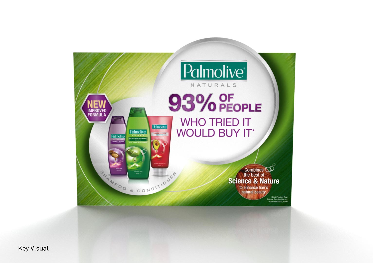
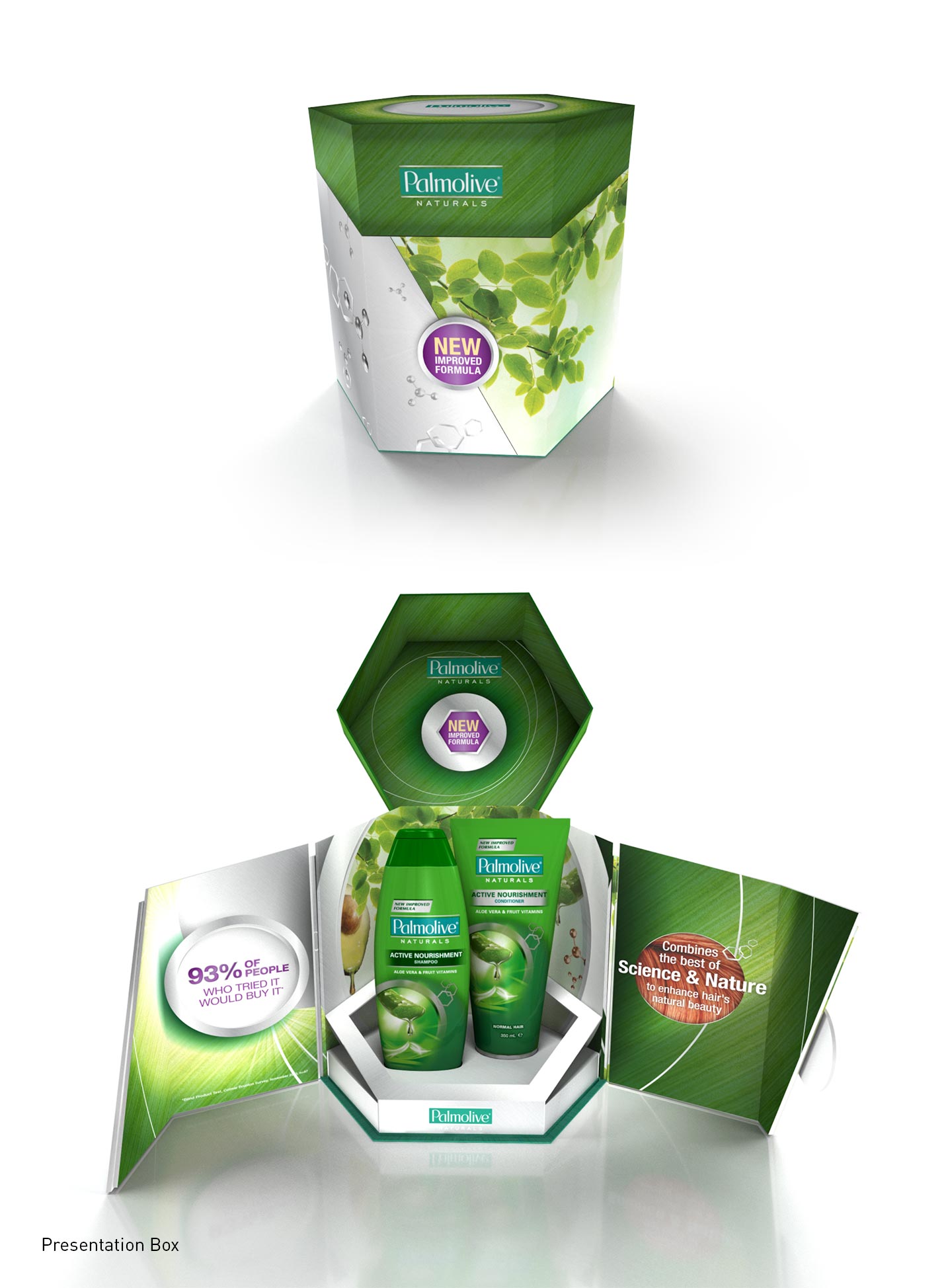
2015 sees a relaunch of the Palmolive Naturals Shampoo & Conditioner range with new bottle, revitalised graphics, improved formula, and additional variants.
To support the brand relaunch, Tweak was engaged to develop the shopper key visual to be leveraged across in-store Point of Sale (POS), advertising, and online materials. Following consumer product trials it was discovered that 93% of consumers that tried the new Palmolive Naturals would buy it. With such a positive outcome it was decided that the POS should be built around that statement. A framework was designed to both introduce the new look and provide an open white space for the key statement to be housed. The new look pack includes a metallic circular frame which surrounds the variant ingredient imagery. This element inspired the circle structures which are easily recomposed for narrow web banners or large posters whilst maintaining a consistent overall look. The New Formula icon was an important point of communication, as it backs up the key statement, and informs of a real product improvement. The hexagonal shape is reminiscent of molecular structure diagrams; a visual reference to the formula. A green leaf textured background was used as it is relevant to all variants and conveys the message of ‘natural’, which is a key attribute of the range.
Palmolve Hair Care is featured in the PKN eNews.