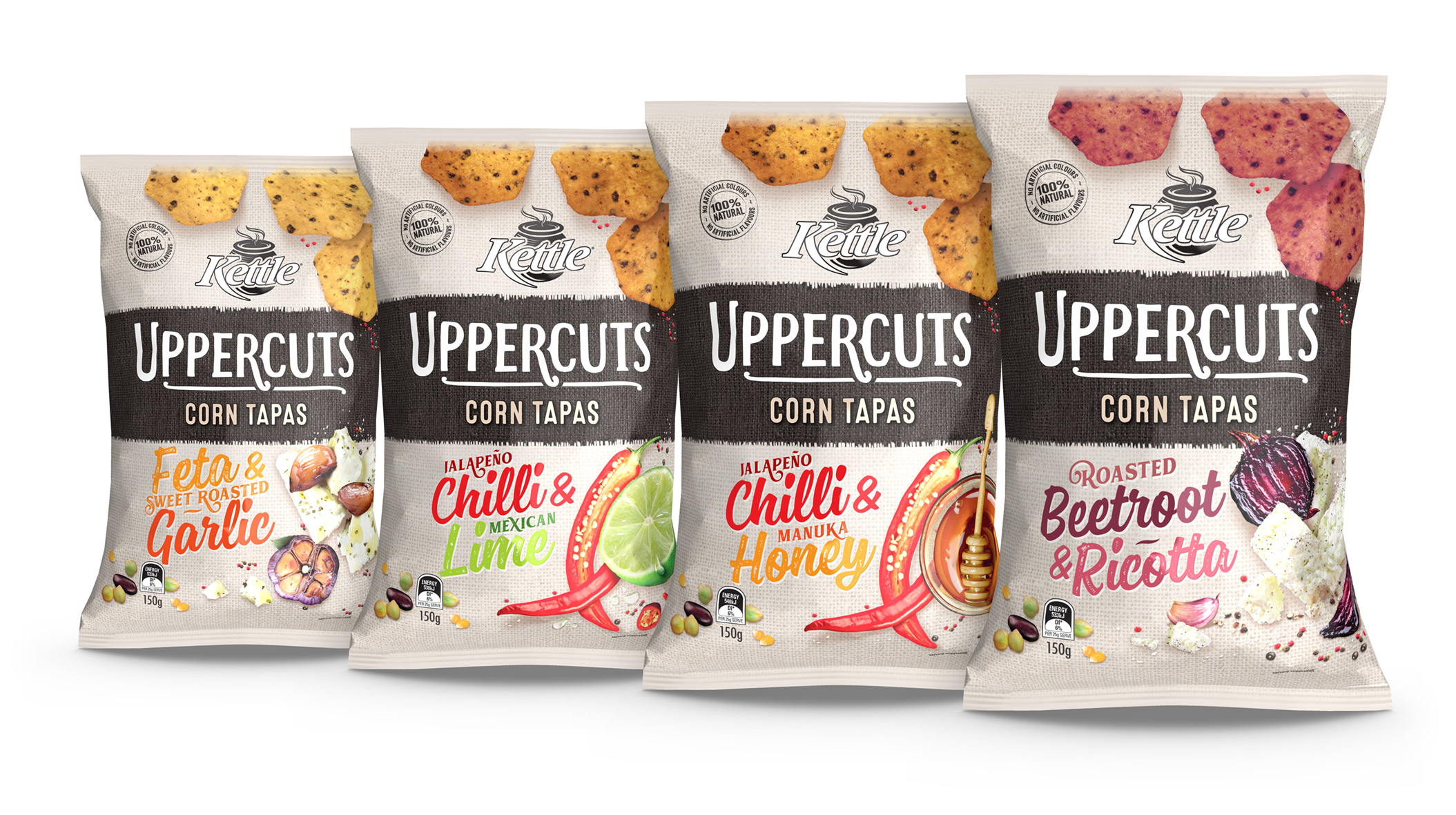
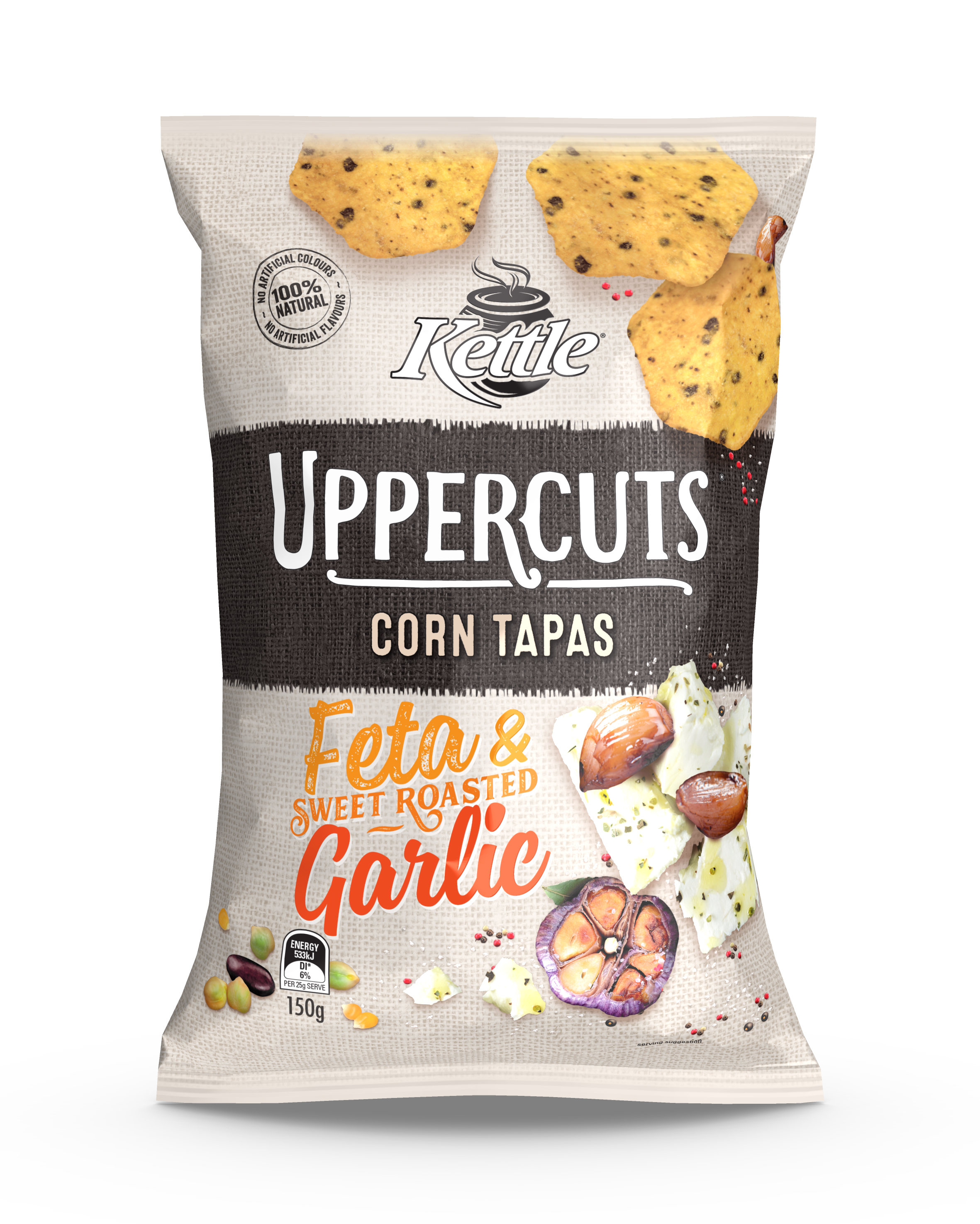
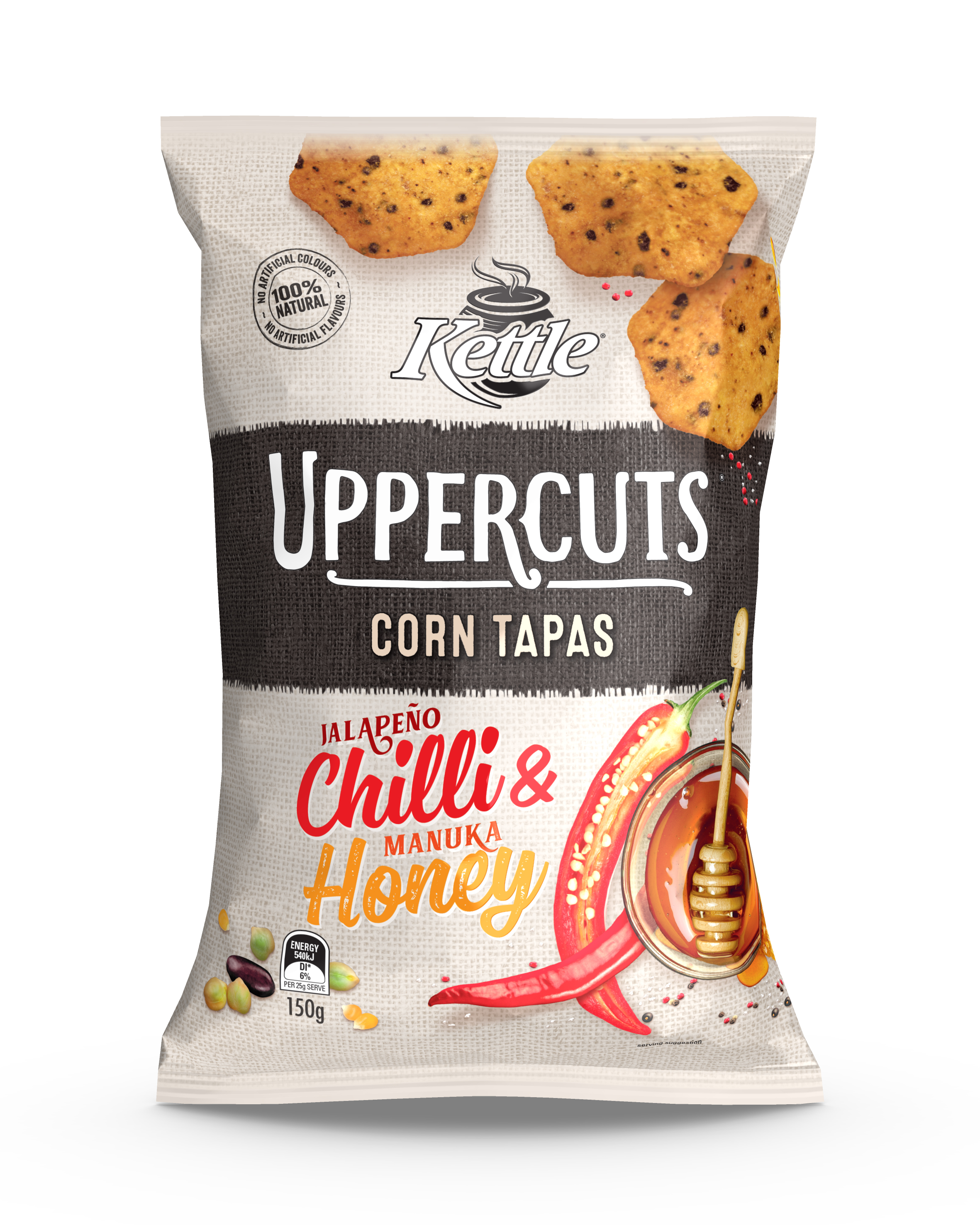
The Kettle brand is synonymous with quality crafted potato chips and Tweak leveraged these credentials in the packaging for its new corn-based chip, Kettle Uppercuts. It was important that the design maintained the brand’s premium visual equities and also excited consumers with a distinctive, new shelf presence. Using Kettle’s distinctive black and hessian brand architecture as a platform, Tweak added bold, colourful ingredient photography and expressive typography to target the corn chip consumer. An all-over matte varnish with spot gloss adds a tactile finish and highlights the product’s healthy ingredients and delicious flavours.
The Kettle Uppercuts was featured on PKN eNews March 2019