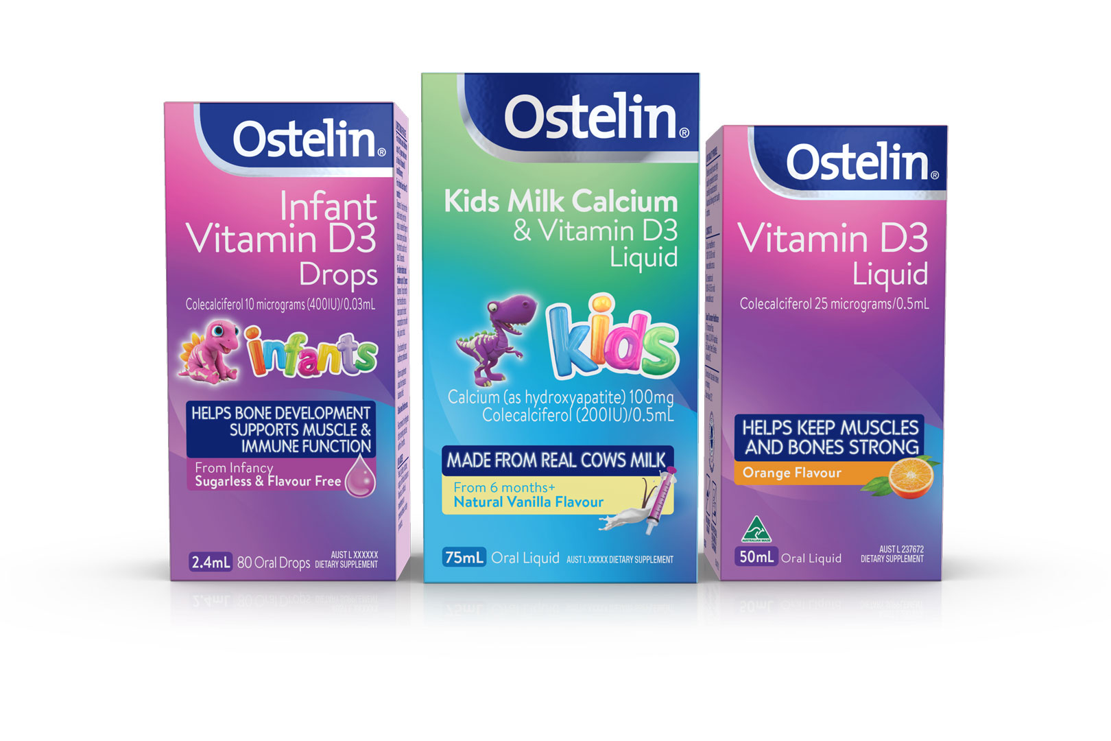
In a heavily saturated category, Ostelin needed to work harder to standout from the crowd. Tweak streamlined and modernised the packaging to increase premium cues and better connect with consumers.
Bolder typography, brighter colour backgrounds, a refined logo with silver foil accents, and a matte varnish boost shelf navigation and maintain consumer recognition.
Working with Ostelin’s signature blue and its successful TV campaign, Tweak added blue panel communication to retain brand heritage and better connect the range.