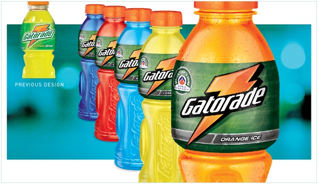
 The Gatorade brand was refreshed due to consumer trends and new offerings in the market place. The brand needed to move in a similar direction as large sporting brands, which are seen as cool, aspiring and leading edge. Dark green colours and metallic silver strip added a premium, cool edge. The Logo was transformed to look stronger and more modern while still maintaining consumer recognition of Gatorade on shelf.
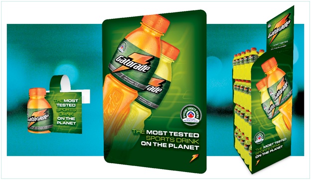
It was critical to develop powerful and consistent Point of Sale material to engage consumers and show the new brand image. The new imagery visually dominated at point of purchase and presented the brand as the major player in the category.

